US Government Spending Statistics From 1960 to 2010
 The spending practices of the United States is one of the hot-button issues right now in the country.
 And why not? The current outstanding public debt of the United States is nearly $14 trillion and is growing every day. By 2020, the country is expected to have right around $20 trillion in debt.
This figure has gone parabolic over the past couple of years, thanks to a couple of trillion dollar plus deficits that have been posted during the first two years of President Obama�s administration.
Most Americans recoil at the thought of borrowing and owing THAT much money.
Some politicians seize on these emotions by speaking up loudly against the raising of the �debt ceiling� in the country. The debt ceiling is a limit set by Congress that determines the maximum amount of debt that the country can run up. For instance, if the debt ceiling was set at say, $14 trillion, then the United States wouldn�t be allowed to borrow more than this amount without the ceiling being lifted.
This year it is the Republicans who are threatening to block an increase in the nation�s debt ceiling. In past years, it has been the Democrats who have been arguing noisily against increasing the nation�s debt ceiling. The issue gets tossed around like a hot potato on an almost-yearly basis, depending on which party is currently controlling the White House.
The question then becomes - which party has historically been the biggest spenders? The Republicans claim to be about smaller government, but do their actions back this up?
Let�s take a look at the numbers from 1960 to 2010. I am going to break this down by control of White House, control of Senate and control of the House of Representatives.
--
First off, it�s hard to declare that either the Democrats or the Republicans are the party of �fiscal restraint� when the country has posted an average annual budget deficit of $160.99 billion (after accounting for inflation) from 1946-2009, but anyways..
From 1960 to 2010 (a total of 51 years), US government spending has grown by an average of 7.63% per year. This compares to an average annual inflation rate of about 3.38% and an annual average population growth rate of a little less than 1%.
So, right off the bat, US government spending has increased at a rate far greater than both the rate of inflation and the population growth rate. Not a big surprise there.
Now let�s break down YoY (Year Over Year) growth in spending based on which party has controlled the White House, from 1960 to 2010:
Republican President, 29 Years, Annual Spending Increase of 7.58%
Democratic President, 22 Years, Annual Spending Increase of 7.68%
Very close. Now let�s look at the inflation adjusted numbers:
Republican President, 29 Years, Annual Spending Increase of 2.96%
Democratic President, 22 Years, Annual Spending Increase of 4.09%
--
Ok, now let�s break down the spending increase numbers based on which party had control of the House of Representatives, 1960-2010:
Republican Control of House, 12 Years, Annual Spending Increase of 5.12%
Democratic Control of House, 39 Years, Annual Spending Increase of 8.40%
Now, the inflation adjusted numbers:
Republican Control of House, 12 Years, Annual Spending Increase of 2.51%
Democratic Control of House, 39 Years, Annual Spending Increase of 3.73%
--
Lastly, the numbers based on which party had control of the Senate:
Republican Control of Senate, 16 Years, Annual Spending Increase of 6.47%
Democratic Control of Senate, 35 Years, Annual Spending Increase of 8.15%
The inflation adjusted numbers:
Republican Control of Senate, 16 Years, Annual Spending Increase of 2.93%
Democratic Control of Senate, 35 Years, Annual Spending Increase of 3.68%
--
A few more pieces of random information to close this article out:
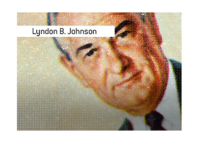
-president with highest inflation adjusted YoY spending growth - Lyndon B. Johnson
-president with lowest inflation adjusted YoY spending growth - Bill Clinton
Filed under: General Knowledge


